Farmer's Wife Quilt - The Big Assembly
 July 16, 2012
 I wouldn't be surprised if you thought I was ignoring my FW quilt because you know how OCD I am with block placement and all my silly rules about colors and prints etc. not touching and all that. Some of you even (rightfully) poked fun at me and how hard a time I was going to have with the layout process of my 98 blocks. Remember the nightmare I had with only 12 blocks?! LOL!
 Lucky for me I still have a few brain cells that operate on common sense and they made me realize it was totally, utterly and completely IMPOSSIBLE for me to lay out this quilt AND follow all my rules ... AND keep my sanity.
So.
I let all my silliness go ... (ok, maybe just most of it ...)
 I really only made sure that:
- the reds were evenly distributed (100% successful)
- the blocks - which I sorted into "lights" and "darks" - weren't clumped anywhere (mostly successful ... found a few problems after the top was put together ... I just practice taking deep breaths when I notice them)
- and of course I tried to avoid any obvious color/print touching (much leniency was required in this regard)
So now let me show you how it all came together.
 It's not often a quilt looks as good or better in real life than it did in my mind when I started. It's always still a bit of a surprise to me. Sometimes I'm close, others are total disappointments.
 But never mind. My Farmer's Wife quilt is an unmitigated success. For me.
Remember my pink sashing disappointment ...
 because I was trying to make my quilt look like this ... ?
 Well, I officially forgive that pink fabric for not cooperating because I gotta say, I'm THRILLED with how the white turned out. I especially love how the white background blocks "float".

The red. Ok. I'm not much of a red girl ... unless it's for Christmas or Valentine's Day.
However, from the very start - before I even made my first block - I pictured this quilt with red ... sparkle ... you know? I didn't want any bold or heavy redness so I carefully used it just as little bits here and there.
 For the few red (& white) only blocks I used prints that weren't dark, but had lots of white or other colors in it, like these.

(There's a reason why this block is going on the back ... )
 And the red posts? They finish at a mere 3/4" and seem to hold everything together.
 When I stand back and squint my eyes to look at this quilt, I'm fascinated by the pretty, "random" geometric pattern created by the red punctuations. (I overexposed this photo to help you see what I mean.)

Oh, and one more thing about the posts. I wasn't wild with the finish in the book and how the outside posts were cut in half.
 That would have driven me banana nuts crazy. So I made mine full squares.
 And I am so pleased with how the light blue side-setting triangles frame the blocks without being too .. chunky. Subtle, but effective to my eye.
Also the book only has one large border. I wanted something a little different. So I added an inner border the same fabric & width as my sashing.
And then I went with this happy blue dot - mostly because I have limited "Flower Sugar" yardage in my stash.
 But I wonder if I had a choice of every print in my quilt that I would have picked this one anyways. It's perfect. Grounding, happy, love the personality of the dots ... it's strong enough to hold up as a frame, but not too busy as to take the focus away from the intricate piecing in the blocks.
No, it's not pink.
And no, I don't care. ;)
For width, the outer border finishes the same width as a block (4 1/2"). It always seems logical to me to repeat a dominant measurement from the body of a quilt for the border.
I'm also going to bind it with the same border fabric. I was originally planning either red or scrappy, but now I think both those options would be too much. I'm just gonna keep it simple.
Now. I'm still not sure about these blocks being stuck in the bottom corners.
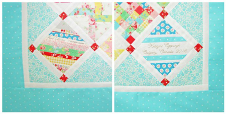
I don't know why, but I assumed the signature should go in the bottom right corner .... you know ... like where you sign a letter. That is until someone suggested placing it in the middle. Oh that would be so nice!
And I'm not happy with the other horizontal striped blocks so symmetrically placed. Looks ... predicable? And maybe boring. Not sure what I mean. So I'm thinking about moving at least one of them.
But I haven't yet. Cause doing stuff like that makes me cranky.
Sigh.
I should probably just do it. I think I'll be unhappy if I don't.
Oh WHO AM I KIDDING?!! They are staying put. The end. ;)
And a quick mention about this "Flock of Birds" block ... I set it so the birds are flying east ...
 ... 'cause remember my crazy birding sister? She lives east of us. So the birds are flying in her direction.
But now to the quilting decision. I have a habit of cheaping out on things sometimes - either with the border, or the backing ... or in this case, the top-stitching. And then I live to regret it.
 I can do it myself with a cross-hatch - classic, acceptible ... but not necessarily the best option for taking this quilt to the next level of amazing, right?
I could free-motion quilt it, but my FMQ repertoire is limited at best and totally inappropriate for this quilt at worst.
So lucky for my I've let my BFF talk me into having it longarmed ... so now I'm saving my pennies.
 Kristyne |
  97 Comments |